- This blog post shows how to compute a health score by assigning weights, scoring each part, and adding them up to get a 0-100 number.
- Validate the score by seeing if the accounts you flagged as at risk really did churn more often over the past 2-3 quarters.
- Look at your own old churn history to set weights.
- Pick score cutoff lines that fit your team's real work capacity.
- Run a test on old data before you build any charts or screens.
- Count how many accounts left while their score still looked safe and green.
A customer health score is a simple metric that combines support tickets, product usage, and NPS feedback. These are depicted in colorful “red, yellow, or green” bands and signal whether an account is likely to renew or churn.
It rolls together how much they use the product, how often they contact support, and how they feel about it.
This matters because higher usage + fewer complaints + positive sentiment = healthy; the opposite = at risk.
Alternatively, it sometimes becomes difficult to decide how much each factor should count (weigh) and where to pause.
Some B2B SaaS based companies have experienced a steep decline from 88% to 84% in gross revenue, making customers lose their money.
This image gives an idea about the Backtest method to check customer health score:
Customer Health Score = Net Promoter Score, Customer Satisfaction Score, and Customer Effort Score
If you are building a health scoring model, you must know how to weigh these survey metrics against behavioral data and the difference between leading and lagging health indicators.
Disclaimer: This content contains some affiliate links for which we will earn a commission (at no additional cost to you). This is to ensure that we can keep creating free content for you.
Table of Contents
What Is a Customer Health Score?
A customer health score measures how likely an account is to renew or churn. It pulls together data on how the customer uses your product, how often they contact support, and how they handle payments. There is no single standard for what a health score looks like. Some companies use a number from 0 to 100. Others use a letter grade, a color like red, yellow, or green, or a status label such as healthy, at risk, or critical. The scale you pick depends on what your team finds easiest to read and act on.
For example, a software company might track a client who logs in every day, files very few support tickets, and pays invoices on time. That account would show up as green, or healthy, signaling a strong chance of renewal.
A second client who has stopped logging in, opened several angry tickets, and missed a payment would show up as red, or at risk, telling the account manager to step in before the contract ends.
A customer health score gives sales and marketing a shared, objective read on account viability instead of relying on how satisfied a client appears.
For sales teams, it flags which accounts are ready for expansion and which are at risk of non-renewal ahead of contract cycles, so outreach can be prioritized accordingly.
For marketing teams, the score directs targeting by segment: high-scoring accounts become candidates for case studies and advocacy, slipping scores trigger retention campaigns, and falling engagement metrics prompt re-engagement outreach.
Because the score is built on behavioral data rather than stated feedback, it can surface churn risk early, even when a client's direct feedback still sounds positive.
The image below shows the inputs a Customer Success Manager (CSM) uses to calculate the customer health score.
Customer health scores tell you which accounts are slipping before they cancel. When a score drops, that account moves to the top of your outreach list, so your team can step in while there's still time to fix the problem.
This also makes your revenue forecasts more accurate, because you're basing them on how customers actually behave instead of guessing who might leave.
Say a customer bought 50 licenses a year ago but only 12 people log in each week now, support tickets have gone quiet, and the main contact who championed the purchase left the company.
Each of those is a warning sign, and together they pull the health score down. Your team sees the drop, reaches out to schedule a check-in, and finds out the customer never got trained on half the features they paid for. You set up training, usage climbs back up, and the renewal that looked shaky is now safe.
To know how healthy a customer account really is, you have to look at two things: how the customer feels about your product and how they actually use it day to day. Sentiment tells you their mood. Usage tells you their behavior. A health score pulls both together so you can spot at-risk accounts before they cancel.
Say a customer gives you glowing feedback in a survey, but their team logged in only twice last month and stopped using your core feature. The sentiment looks fine, but the usage data says trouble is coming. Most of what you need to track this is already sitting in the tools you have.
It helps marketing teams focus on case studies, retention campaigns, and re-engagement triggers based on behavior. It also exposes hidden churn risks early, allowing teams to act even when client feedback seems positive.
How Does a Customer Health Score Work?
A customer health score pulls raw updates from four different places. It matches every piece of data to a shared scale, multiplies each piece by its importance, and combines the totals into one final score. Then that final score is converted into a clear color band.
1. Your Signals Live in Four Different Systems
A customer health score pulls from several data sources, and each one lives in its own tool. Your CRM holds account records and renewal dates. This product analytics tool tracks how often people log in and which features they use. Your help desk stores support tickets. Your feedback platform collects survey responses.
This image gives an idea about three ways to structure scoring models:
2. Each Signal Gets Normalized, Then Weighted
Login counts, star ratings, and ticket volume cannot be compared directly. You can first convert them to a common scale, such as 0–100, and then apply weights. Add the weighted pieces together to get a single health score. Signals that are more useful for predicting churn or expansion can carry more weight, while less useful signals count for less.
3. The Final Score Maps to a Band
A band is a range that a score falls into. After you calculate the final score, you match it to a band. Each band carries a clear meaning and a set action.
Bands matter because a raw number is hard to act on. A score of 72 does not tell your team what to do next. A band does.
It sorts every account into a simple group: healthy, watch, or at risk. If your scale ranges from 0 to 100, you set three bands.
A score of 80 or higher falls in the green band. That account is healthy and needs no extra attention.
A score from 50 to 79 lands in the yellow band. That account needs a check-in.
A score below 50 is counted in the red band. That account is at risk, and someone should reach out right away.
Therefore, a score of 72 falls in the yellow band and needs a check-in.
For this, consider the data across four systems (analytics, help desk, feedback platform, and CRM). Combine it into one standard scale, multiply by weight, and total the scores into actionable work bands.
Why Is It Important To Check Customer Health Scores?
To check Customer Health Score, we pull data from four places: analytics, the help desk, our feedback platform, and the CRM. Each source uses its own numbers, so we convert them to one shared scale.
Then we assign a weight to each source based on how much it matters. We add up the weighted scores to get a single number for every account. That number sorts accounts into clear priority bands, so your team knows where to focus first.
Here is why this helps. When one account's score starts dropping, you see it early. You can reach out before a small problem turns into a lost customer. For example, say a customer logs three support tickets in a week, stops opening your emails, and gives a low feedback rating.
Each signal on its own might slip past you. Combined into one score, that account moves into the high priority band, and your team can step in while there is still time to fix things.
Retention Is Tightening Across the Market
Gross revenue retention (GRR) measures how much recurring revenue a company keeps from existing customers after accounting for churn and downgrades.
It does not include expansion revenue from upgrades or additional purchases.
If a SaaS company starts the year with $1 million in recurring revenue and loses $100,000 from cancellations or downgrades, its GRR is 90%.
Benchmarkit’s 2026 metrics report shows changes in GRR performance among B2B SaaS companies.
This image gives an idea of the Benchmarkit review report on B2B SaaS Gross Revenue Retention:
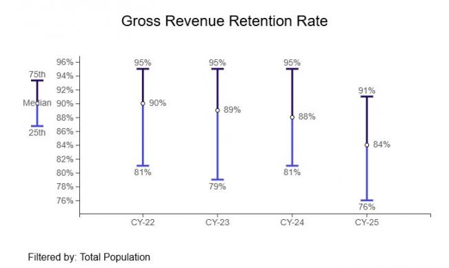
Image via Benchmarkit
Net revenue retention (NRR) includes both customer losses and expansion revenue, such as upgrades, add-ons, and increased usage. As a result, NRR can go above 100%.
If a company starts with $1 million in recurring revenue, loses $100,000 from churn, but gains $200,000 from expansions, its NRR becomes 110%.
ChartMogul’s 2025 report provides NRR benchmarks from its own dataset of B2B SaaS companies, offering a separate view of retention performance.
Since GRR and NRR come from different reports and measure different retention factors, use them as individual benchmarks rather than direct comparisons of the overall SaaS market.
It Turns CSM Time Into a Decision
A health score can reduce the amount of manual account review by helping teams prioritize where to look first. It supports judgment rather than replacing it, and can help quieter at-risk accounts get attention sooner.
One Unified Number To Analyze Both Sales And Success
Sales and success usually track different things. Sales look at deal size and contract dates. Success looks at product usage and support tickets.
So when they show up to a renewal call, they're often working off two different pictures of the same customer, and that mismatch shows, especially to the customer.
When both teams look into one data sheet for a health score, they need to agree on how the score is built and define what goes into it.
Also, they need to weigh and update it on the same schedule. If sales counts a stalled deal one way and customer success counts it another, the numbers split and alignment falls apart.
Health Score ranges from 0 to 100 and considers product usage, support ticket volume, and renewal date proximity. Sales and customer success both decide that usage counts for half the score, tickets count for a third, and renewal timing makes up for the remaining percentage.
They also agree that active usage means at least one login per week, not just an open account.
Now, when an account drops to 60, both teams see the same drop for the same reason and can act on it together instead of debating what the drop means.
How Does It Work?
A CSM watches for obvious warning signs like a jump in support tickets, a meeting that gets canceled, or an email that suddenly turns short. Usage decline, though, often slips past everyone.
If a customer keeps paying on time, but three of their five paid seats go completely unused for a month, billing looks healthy, so nothing gets flagged, yet that drop in real usage is one of the clearest signs the account is slipping.
When every team can pull up the same health score, those scattered clues sit in one place instead of being buried in separate tools. That shared view is what turns a quiet, easy-to-miss decline into something a team can catch and act on well before renewal comes up.
Retention has dropped from 88% to 84% industry-wide, and net revenue retention sits at just 82% even after counting upsells. Old warning signs show up too late. A working health score gives teams a full quarter's notice before a renewal is at risk.
What Metrics Go Into a Customer Health Score?
A customer health score is built from three groups of metrics:
- behavioral (how often and how deeply a customer uses your product),
- relational (how the customer interacts with your team, such as support tickets, survey responses, and meeting attendance), and
- commercial (how the account spends, including contract value, renewal timing, and past upgrades or downgrades).
To decide which metrics belong in your score, look at the accounts that left and the accounts that grew, then find the two or three signals that showed up before each outcome.
Behavioral signals lead the way. Login frequency, feature adoption, and seat usage shift before anyone files a complaint or misses a payment.
Relational and commercial signals confirm what behavior already hinted, so keeping a close watch on product activity gives you the earliest window to act.
Is Calculating a Customer Health Score Easy?
Yes, a health score is not one size fits all. You need to know which outcome you are measuring, because the labels and weights change depending on the goal. Overall account risk blends the signals above into one broad view of account stability.
Once you have good inputs, you calculate the score in five steps.
- First, decide what outcome you want the score to predict.
- Second, pick the signals that point to that outcome.
- Third, put every signal on the same scale, such as 0 to 100, so they can be compared fairly.
- Fourth, give each signal a weight based on how much it matters, then add them together.
- Fifth, sort the total into a band like green, yellow, or red.
Let’s say you build a churn score with three signals. Product logins get a weight of 50 percent, support ticket volume gets 30 percent, and last invoice payment status gets 20 percent.
A customer logs in daily (score 90), files very few tickets (score 85), and pays on time (score 100).
Calculate (90 × 0.50) + (85 × 0.30) + (100 × 0.20), which equals 45 + 25.5 + 20, for a total of 90.5. That lands in the green band, so this account looks healthy.
Expansion Score As a Necessary Next Step
If you later want an expansion score instead, you can swap in different signals and different weights, and the same customer could land in a very different band.
1. Start with the outcome you want the score to predict
A health score is only useful if it points at one clear result. Before you build anything, decide what the score is meant to predict, because a score built for churn is not the same as a score built for renewal, expansion, or overall account risk.
2. Pick the signals you can actually use
Your signals will usually come from three places: how people use the product, how the account relationship is going, and what the sales and billing records show. Before you weigh anything, check that these signals are filled in and clean for every account you cover.
3. Decide how you will tie the data together
Your usage data, support tickets, and billing records almost never sit in the same system, and they rarely spell the account name the same way. Tools like Zapier or a HubSpot connection can move this data from one place to another, but moving data is not the same as matching it.
4. Put every raw input on the same scale
When you convert, some accounts will land outside the range, for example, an unusually high login count that would score above 100. Force those readings back inside the limits so nothing goes over 100 or under zero. That correction is called clamping, and it keeps one extreme account from throwing off the rest of your model.
5. Handle negative signals with inverse scoring
Multiply each small score by its importance, then add them together to get a final score from 0 to 100, which is exactly how sales software scores leads, but focused here on keeping customers.
For survey responses, define a conversion rule that fits your model. An individual 0–10 likelihood-to-recommend response is not an NPS score by itself. If you use response categories, document how detractors, passives, and promoters are converted and validate that rule against your historical outcomes.
6. Assign the Band
Convert the number into a status the team can act on: green, yellow, or red. Cut-points are a judgment call, not a formula output, so the next section earns them from your data.
This image gives an idea about how to weigh and measure various metrics to calculate a final customer health score:
You can't add logins, tickets, and survey replies across scales together. To calculate a correct customer health score, normalize each sub-score to a common range first, then apply its weight. Then assign a color band.
How Do You Set the Weights in a Health Score?
Look at historical accounts that renewed and those that churned. Compare their signals before the outcome to see which measures show the clearest differences between the two groups.
Those comparisons can help you choose starting weights, which you should then validate on separate data.
Take every account you lost last year and every one you kept. Score each one using only the information you had before its renewal date, and set that scoring point to match how your business actually runs.
The right lookback is not a fixed number. It depends on how long your sales cycle takes, how long your contracts last, how much lead time your team needs to step in and save an account, and what you are trying to predict.
A company that sells annual contracts with a slow, high-touch renewal may need to look back five or six months, because that is when the early warning signs show up and when there is still time to act on them.
A company that sells month-to-month subscriptions might only need to look back two or three weeks. Choose the window that gives your team enough room to actually change the result, then score every account at that same stage in its life so every comparison is fair.
1. Compare the Gaps on the Normalized Scale
Compare the two groups on the normalized 0-to-100 sub-scores. A gap of six logins and a gap of fifteen sentiment points aren’t comparable until both sit on the same scale. Remove any signal where both groups look identical and carry no information.
This image illustrates the anatomy of one scored account and gives an idea about corrective actions to take within time:
2. Assign Weights in Proportion, Then Test Before You Trust Them
Start by measuring the gap between accounts that churned and accounts that stayed for each signal.
A signal can look very different across the two groups and still fail to predict churn once you test it, so treat a big difference as a reason to investigate, not a reason to reward.
Before a signal earns any weight, run it against past accounts and ask whether it actually separated the customers who left from the ones who stayed.
Only signals that hold up in that test deserve real weight, and the weight should track how well each one predicted the outcome.
Next, check how your signals relate to each other. Two signals that rise and fall together, such as logins and seat utilization, usually carry the same information.
If you give both full weight, you count that one insight twice and tilt the model toward it, which crowds out signals that tell you something new.
Instead, keep the stronger of the pair or fold the two into one combined usage measure, then weight that once.
Spread the rest of your weight across signals that each add fresh information, and confirm the total lands at 100 percent.
Compare the 90-day scores of customers who left against those who stayed. Give the most weight to signals that show the biggest difference between the two groups. Remove any signals that show no difference, and if two signals tell the exact same story, delete one of them.
Does a Customer Health Score Actually Predict Churn?
A research paper was released in 2025. Victoria Emanuela Alves Oliveira and colleagues wrote it, based on Predicting B2B Customer Churn and Measuring Its Impact on Implementing Machine Learning Strategies.
Although it is fair, it cannot be fully trusted. Studies show these scores catch churn well (90%+ accuracy) but flag too many false alarms, and accuracy alone hides the drop. A solution to this is to retrain models often, not trust a fixed schedule, and always double-check past green accounts that are still left.
What Is a Good Customer Health Score?
A good customer health score depends on how your model is designed and how well it predicts outcomes such as churn or renewal. There is no universal score or percentage that counts as healthy, so teams should set thresholds based on their own customer data and validate them regularly.
For a model, higher scores generally indicate healthier customers. Some teams may define 75-100 as “Green”, but the thresholds should reflect your signals, weights, and historical data.
Look for stable differences rather than choosing a cut-point from one sharp movement in a small sample. Set risk bands based on predictive performance, then make sure the actions behind those bands match your team’s capacity.
For example, a red account may trigger an immediate review, while a yellow account may receive a scheduled check-in.
- Score every customer, then split them into 10 equal groups (deciles).
- Check the real renewal rate for each group.
- Use historical score groups to see how renewal or churn rates change across the distribution.
This image gives an idea about good and bad health scores:
Customer Health Score vs NPS, CSAT and Churn Score
A health score can combine NPS and CSAT scores.
Net Promoter Score is a population-level index, promoters minus detractors, running from −100 to +100.
One respondent’s 0-to-10 answer isn’t an NPS; it’s an input to one.
Customer Satisfaction asks how someone felt, usually about one interaction.
Customer Effort Score does not come in one fixed format. The scale is not fixed either. You may see 1 to 5, 1 to 7, and sometimes 1 to 10.
Because of that, do not assume any benchmark until you read the exact question and confirm the scale your tool uses. If your survey asks “How easy was it to get help today?” on a 1 to 7 agreement scale, then 5, 6, and 7 signal low effort and count as strong scores.
But if your survey asks “How much effort did you have to put in?” on a 1 to 5 scale, then a 1 or 2 is the strong result and a 5 is the weak one. Same metric name, opposite reading. Check the wording and the scale inside your survey tool first, then decide what a good score looks like.
This image gives an idea about two components of Customer Health Score:
A practice of regularly checking customer health scores helps in finding churn rate in a much better way and within time. A health score answers a broader question and supports expansion too.
Because NPS is one ingredient, not a rival dish. Health Score blends NPS, CSAT, usage, and billing data into one live picture. Comparing them is like judging a cake by tasting only the sugar.
Which Customer Health Score Software Would You Select?
If you're choosing customer health score software, start with a tool you already use if it supports the scoring features you need. Choose dedicated customer success software if you need more advanced health scoring and account management capabilities.
Several tools can help you manage customer health scores, with HubSpot being one option. HubSpot’s customer health score is available in the customer success workspace for eligible Service Hub plans. The purpose-built alternatives to HubSpot to calculate Customer Health Score:
| Platform | What the score is called | Configurable | Public pricing | Best fit |
|---|---|---|---|---|
| HubSpot Service Hub | Health score (customer success workspace) | Yes: points, weights, decay | Professional from $90/seat/mo billed annually or $100/seat/mo monthly; Enterprise from $150/seat/mo | Teams already on the platform who want scoring without a second system |
| Gainsight | Health Scorecards | Weighted measures; depth not publicly documented | Not publicly listed | Large success orgs with dedicated CS Ops |
| Totango | Multidimensional health | Yes, weighted variables | Not publicly listed | Teams wanting composable success programs |
| ChurnZero | ChurnScore | Yes, weighted factors | Not publicly listed | Mid-market SaaS focused on renewals |
| Planhat | Health Score Profiles (0–10) | Yes, 2–8 factors | Not publicly listed | Teams wanting a simpler scoring scale |
| Vitally | Health Scores | Configurable; depth not publicly documented | Not publicly listed | Product-led teams with heavy usage data |
| Custify | Health Scores | Yes, personalized | Not publicly listed | SMB-focused success teams |
This image gives an idea about how to build a custom health scorecard:
Purpose-built platforms are helpful in channelizing health checks, flagging at-risk accounts early, and helping CSMs prioritize which customers need attention first.
It majorly depends upon the size of the team. HubSpot's health score lives in Service Hub Professional/Enterprise, is fully configurable with points and weights, and works well if you want one system.
Larger success teams make use of Gainsight or Totango dedicated platforms for deeper scorecards and automation, though pricing stays quote-only.
What are Common Mistakes to Avoid While Checking Customer Health Score?
A customer health score helps you see if users like your product or plan to leave. The biggest health score mistakes do not come from bad data, wrong staff rewards, or hidden drops in customer health. Small changes might often go unseen, and you only notice when the contract ends and they leave.
Avoid mistakes like:
- Tracking too many metrics at once
- Relying on a single metric to judge overall user health
- Tracking too many complex indicators at a time
- Ignoring early signs of dropping user activity or engagement
- Forgetting to update your scoring model as your product grows
- Failing to share health data across your support and sales teams
- Collecting data without setting a clear plan to take action
A CSM Score (CSM Sentiment, Customer Pulse, or RAG Status) relies entirely on human judgment and direct communication context. A customer might have excellent product usage data but might reveal in a private meeting that their budget is being cut. Only a CSM can catch such points.
FAQ
Q1. How Do You Make a Customer Health Score From Scratch?
A. Define the outcome you care about, pick a handful of signals you can pull cleanly, normalize each to a 0-to-100 sub-score, weigh them, and sum. Then cut bands from your own score distribution and backtest the result against accounts you already lost.
Q2. How Is a Health Score Calculated?
A. Normalize each input to a 0-to-100 sub-score, multiply each by its assigned weight, then add the results together. Raw logins and ticket counts sit on incompatible scales and can’t be summed directly. The total then lands on the same 0-to-100 scale as its component parts.
Q3. What Is a Customer Scorecard?
A. In most success platforms, the scorecard is both the model and the view. It defines the measures and weights, and it displays the composite alongside every input that produced it. A customer success manager checks which signal changed instead of just showing that a customer's score dropped.
Q4. What Is a Predictive Customer Health Score?
A. Instead of summing hand-set weights the way a rules-based model does, a predictive Customer Health Score is based on historical churn events and matters whenever a CSM has to justify an intervention.
Q5. How Often Should You Update a Customer Health Score?
A. The score updates whenever new ticket data comes in, so how often it changes depends on how frequently that data is available. If tickets flow in constantly, the score can update in near real time.
If data arrives once a day or once a week, the score updates on that same schedule. The rules and weights that produce the score should be reviewed when the score stops matching reality or when the business changes what it cares about.
Q6. Can I Run a Customer Health Score in HubSpot, or Do I Need a Dedicated Platform?
A. Yes, you can build a customer health score if your account is on Service Hub Professional or Enterprise and you have a Service Seat assigned. Inside the customer success workspace, you set up scoring rules that add or subtract points based on customer behavior and record details. On Professional, you can run one active health score, while Enterprise lets you run several across different segments or product lines.
Conclusion
A customer health score is an account-level composite that turns behavior you can see into a prediction you can act on. Whether it works comes down to three decisions, and all three depend on studying your own history.
Look at how past accounts actually behaved, both the ones you kept and the ones you lost. Comparing the two is what tells you which signals matter.
If you study only the accounts that churned, you have no baseline to compare against, so you cannot tell whether a warning sign also showed up in plenty of healthy accounts that stayed.
That mistake, judging the model on lost customers alone, produces weights that look right and predict poorly. Use both groups to set your weights, draw the lines for your safe and at-risk zones, and re-test the model once it is running.
Want a second pair of eyes on how retention data feeds your wider funnel? HubSpot’s Service Hub keeps your feedback, support tickets, and customer history in one place. It’s perfect for teams that want everything working together right out of the box instead of building a complex setup tool by tool.
If you want help turning those touchpoints into conversions, my team offers digital marketing consulting support and runs conversion rate optimization services.
Disclaimer: This content contains some affiliate links for which we will earn a commission (at no additional cost to you). This is to ensure that we can keep creating free content for you.